Responsive UI is a big deal nowadays, when enterprise applications should run on different platforms and devices. Often customers prefer to render simpler functionality screens for mobile devices and give full data entry access only when accessing through regular Web browser on the computer. ADF provides support for this, you can implement responsive UI designs relatively easy, check informative blog post from Shay Shmeltzer - ADF Faces Responsive Design - 12.1.3 Update.
I would suggest to think about responsive UI design from the start, it very much depends on functionality your application offers. It is good idea to start from the template and define facets for various layouts. But this is not only about layouts, you may prefer to render editable forms on large screens and on mobile devices to show only charts for quick overview. I'm going to demonstrate, how you could switch between different regions in ADF UI, depending on current resolution. Download sample application here - ADFResponsiveUIApp.zip.
This is how it works, I'm using iPad simulator, but same would be true for the regular browser display on smaller screen resolutions. Web page displays region with editable columns in horizontal view and same page displays different region with read-only list in vertical view:
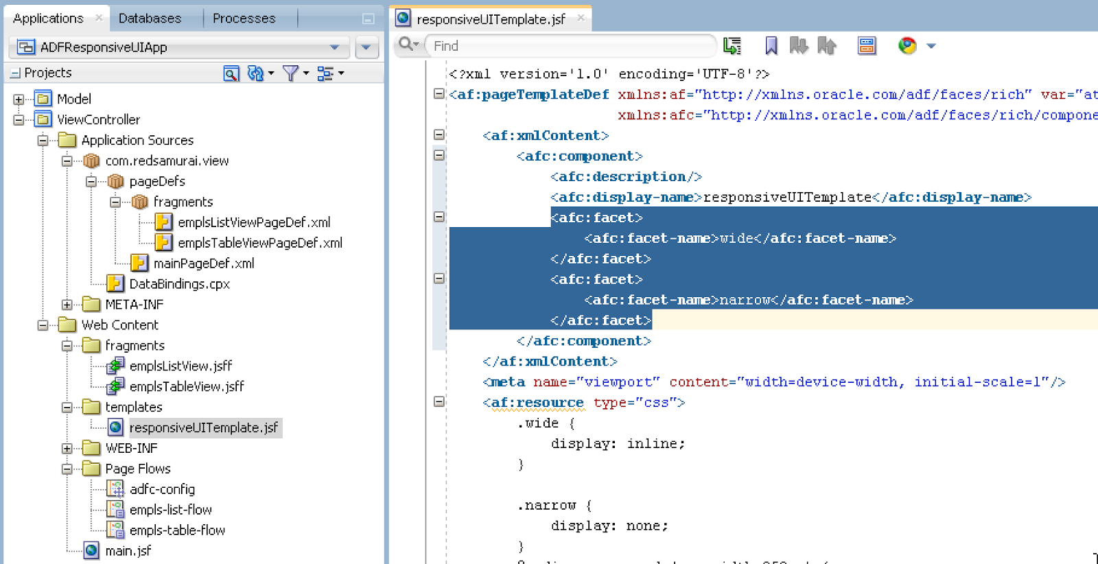
Similar to Shay's sample, there is a template implemented with two facets (each for different layout):

Facet visibility is managed through assigned style class, controlled by CSS media query. It checks if screen width is less than 950px and sets narrow layout to be displayed:

Main page is created based on the template. Here I'm inserting both regions into corresponding facets - wide and narrow:

This is editable table in wide view:

This is read-only list in narrow view:

I would suggest to think about responsive UI design from the start, it very much depends on functionality your application offers. It is good idea to start from the template and define facets for various layouts. But this is not only about layouts, you may prefer to render editable forms on large screens and on mobile devices to show only charts for quick overview. I'm going to demonstrate, how you could switch between different regions in ADF UI, depending on current resolution. Download sample application here - ADFResponsiveUIApp.zip.
This is how it works, I'm using iPad simulator, but same would be true for the regular browser display on smaller screen resolutions. Web page displays region with editable columns in horizontal view and same page displays different region with read-only list in vertical view:
Similar to Shay's sample, there is a template implemented with two facets (each for different layout):
Facet visibility is managed through assigned style class, controlled by CSS media query. It checks if screen width is less than 950px and sets narrow layout to be displayed:

Main page is created based on the template. Here I'm inserting both regions into corresponding facets - wide and narrow:

This is editable table in wide view:

This is read-only list in narrow view:

2 comments:
Hi Andrejus,
Nice article. Still I will say this is not fully responsive . This is still adaptive design. #
If we have 3 sizes then we need to drop 3 region over it.
This is just example of flexibility. You don't need to create separate region, you could hide existing region and load it from panel drawer or render it to be smaller.
Regards,
Andrejus
Post a Comment